Thursday 29 May 2014

FMP Pages

Finally I have finished my Degree and to accompany my final collection are these little gems.

These pieces are advertising posters based on Shakespeare's stories to simplify what the stories portray.


Sunday 11 May 2014

D&AD New Blood Award - XL Recordings

This advertising poster that I created highlights the events of a 1996 gig at Popham Airport in which one of the secret headliners of event was 'The Prodigy'. The poster reflects graphical illustrations influenced by early vintage advertising (with a contemporary twist).


Wednesday 16 April 2014

Blumfeld - An Elderly Bachelor

This piece is part of my FMP at Uni and in which my specialist field is mainly based in advertising.

 
Final Design
 

First Draft

Monday 24 March 2014

'What A Carve Up!' By Johnathan Coe - Penguin Book Cover Competition 2014

I recently was given a brief to create a book cover for an existing title  but to contemporise the novel taking on board on elements of the story as well making it an 'eye-catching' front cover to stand out from other competitors in the market.


Thursday 20 March 2014

Topman Brief!!


I was commissioned to create a series of T-shirt designs with the potential of the Designs being forwarded to the Topman Brand. I heavily enjoyed creating these designs and a sample of 2 of the Designs I managed to Screen Print as it shows what the aesthetic of the design would look like on a fully fabricated piece.


Tuesday 25 February 2014

Redrafted Pages for my Graduate Book

Here are the finalised designs for my Graduate Book. The process has been so difficult but its been really rewarding with both these designs. 
 

Monday 24 February 2014

Both Pages for the Graudtae Book

Both pages here are represented together as what will be featured in my Graduate Book.


Final Graduate Book Page

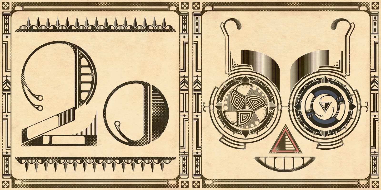
These are early 1920's glasses that are referenced by the Art Deco era.
 
Had a bit of difficulty with this as I wasn't too sure of the outcome. None the less, it does provide a unique aesthetic which I'm quite pleased with.


Monday 17 February 2014

Instagram!!

Hey Guys I've got an Instagram for you to have a butchers at.

Don't be shy follow me @mrwinchillustrations

Instagram
 
Enjoy!!!!!

Graduate Book Page 1

Symbolising on Art Deco, I created my own typography based on the 1920s Art Deco. I rather enjoyed creating this piece as it helped me to find an area of creativity I which I enjoy as well as enjoy adapting a style to create my own.
 
This piece highlights 1 of 2 pieces in which I am creating to go towards my final end of year Graduate Book in which I will be graduating from Lincoln University, UK within this coming year.


Monday 20 January 2014

Heart of Darkness Page Segments

These pieces of final artwork are all representative pieces that show the symbolism of the story from the Ivory trade union to the metaphor of the Congo river representing a snake.
 
Alongside this is a link between the native community and the westernised society that invades the country and enslaves the native people.
 
I hoped to have the ambition to finish this in time for the closing competition but sadly I did not make it in time for the final submission. None the less I have a finished set of illustrations that would have fitted well with the competition.


Tuesday 14 January 2014

Nino & Nina - finished double page Spread

This double page features a scene of the book in which the 2 children are on a bus going through the town and passing a cathedral as they go through. However, I chose not to include any characters in this scene as I wanted to make the scene a less emotional set up and include only buildings and vehicle to enhance the geometrics of the imagery.


Friday 10 January 2014

Nino & Nina Story book - Double page spread

Testing different types of contrast for a double page spread for the Story of Nino & Nina